Dec 17, 2020
1202
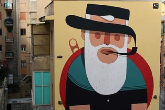
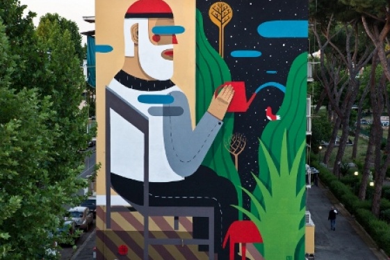
That the urban landscape is a source of inspiration for artists has been known for more than a century: cities and their movement, living and changing have been recorded in various forms already by the impressionists of the mid-nineteenth century. With progress and contemporary means, artists sensitive to vibrations, panoramas and metropolitan decorations, reuse the seeds of communication already formed for society, trying to transform them into messages usable by individuals in the form of new works.
This is also the case of Antonio Agresti and Giuseppe di Costanzo, similar in terms of heritage (they are both from the Campania area) and formation (they are both architects). They choose different paths starting from the ideas that the urban fabric creates for them, and arrive at apparently different results, but with common traces.
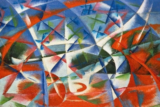
Antonio Agresti, aka "Agre", re-elaborates in collage and drawing sometimes mixed, the paper material of parapedonal signs, advertising and street posters. However, he does not make it a "Rotellian" collage, in his works he overwhelms the lines of force that are recomposed in those fragments that he chooses to assemble. They are perhaps broken perspectives, plants that signal torn streets, that change tract and color after the break. The effect is extremely interesting, graphic and reworked also in a chromatic key, with slippages of the color backgrounds that follow the lines of the subjects represented in the reuse maps. So they dialog with saturated colors with optical prints or shaded with airbrush effect.
The structure of the works of Agre develops on more levels adding to the interruptions of the rips also those of the assembly plans. Works that are placed between the graphics, the poor art, the collage and from the extremely furnishing power. In 2019 he attended an atelier in the "Macro Asylum" project of the Museum of Contemporary Art in Rome, showing his cutting and assembling techniques that are never trivial and have multiple readings.
Giuseppe Di Costanzo draws the inspiration of his works from his daily work. From the architectural projects on which he works are born the traces for his compositions of ink, watercolor and acrylic. Also in this case we are faced with lines of force, repeated, hypnotic, broken in areas as if they were seen from above of cultivated fields distorted by an almost vaporized graphics. The line repeats itself obsessively or starts from an asymmetrical area to generate a geometric design reminiscent of a portion of a city plan overlapped with another portion. The sharpness of his works also creates a mental connection with the Mediterranean landscape made up of Greek villages, Amalfitan terracing, and Arabic differences in height transfigured in its full white to which only small doors or splinters of liquid watercolor survive.
They are works of repeated sign in which to lose oneself very close to the "minimal landscapes" or in his "10x10", where the composit of the frames adds an additional line of emptiness to the graphic field.
The great strength of Di Costanzo's works lies in the balance between positive and negative, a balance that contains a double reading of the negative or empty. In 2019 his works were exhibited in the Bookshop of Palazzo Grassi in Venice and from some of his works were born collaborations with companies such as cc-tapis that created a carpet, reconnecting design to art and architecture.
You may be interested
-
Italian art: 6 things you probably didn't kno...
WTI Magazine #78 2016 April 15Author : Giulia Carletti Translation by: Born...
-
Italian art: A University turned into a museu...
WTI Magazine #63 2015 June, 27Author : Enrico De Iulis Translation by: A ve...
-
Italian art: Accademia Carrara
WTI Magazine #62 2015 June, 12Author : Enrico De Iulis Translation by: John Cab...
-
Italian art: Across the lighthouse
WTI Magazine #52 2015 January, 23Author : Enrico De Iulis Translation by: R...
-
Italian art: Agostino Iacurci
WTI Magazine #23 2014 Mar, 28Author : Enrico De Iulis Translation by: Alessandr...
-
Italian art: Agostino Iacurci's street art
WTI Magazine #81 2016 July 15Author : Enrico de Iulis Translation by: The l...
-
Italian art: Alberto Pasini
Fascinating and mysterious East, boundless and odalisque landscapes, suggestive ruins, far...